I love when a creative vision become a reality. I had a couple ideas for each logo and when I finally got them down on the screen, here's what they looked like:


For the Flying Solo logo, we wound up deciding on the design featured below. There is a lot of background to the logo such as the colors are those of the CU system and the bird is representative of the donors' name.

To create the final T&R Fund logo, I had my clients sign their first initials or rather draw how they envisioned the logo. I traced their handwriting in Illustrator and developed a very personal logo:

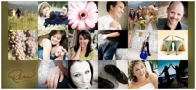
I'm really looking forward to some green grass and leaves as photography will be picking up. This is kind of a slow season for outdoor pictures, however the design never ends. The shoot with my assistant, Jesie, and her boyfriend was postponed until this Saturday. I can't wait for it! They're chemistry is going to be incredible and will make for beautiful images I'm sure. :) Stay tuned!


1 comment:
So talented Rene! I do like the Flying Solo logo you all went with. Very nice. Great idea and design (but we expect no less of you!!!). Hope you enjoyed your time away.
Post a Comment